
You craft the perfect ad copy, scour your image gallery for the best photo, and strategically set up your ad. Then you pour over your email copy, design, and CTA. You place a compelling banner on strategic areas across your website. But what about the page that your CTAs and ads are driving to?
Are you just as thoughtful and meticulous about the landing page? It's something that can be easily forgotten in higher education marketing, but the landing page is where the magic happens — a lead conversion. And yet, oftentimes, enrollment marketers fail to spend enough time and effort on a conversion-centric landing page marketing strategy.
Your ROE (Return On Effort) for a landing page could be huge: a fantastic page will not only bring you form submissions (leads) and new contacts (first-time form submitters), it will also give you a little boost in your organic search rankings.
A landing page is usually a page that stands alone from your website on a subdomain, which you’re driving traffic to for a specific marketing purpose. It typically includes (at the least): a primary offer (a conversion opportunity), a form, CTAs, secondary/tertiary content offers, and value propositions for your offers.
Some common landing pages in enrollment marketing are:
- Resource guide download pages
- Request More Information pages (and/or your formal inquiry page)
- Blog subscription pages
- Event registration pages
- Resource libraries (or quick link pages)
- Thank you pages
So how do you improve and optimize your landing pages? Check out these tips for transforming your lackluster pages into effective, conversion-centric elements of your overall content strategy.
1) Ace the first impression
It takes only seconds for someone to determine if an individual is likeable. In the same vein, as an enrollment marketer, you have only a few moments to hook prospective students and earn their attention.
The primary offender for a landing page (which results in an unhealthy bounce rate) is when the offer that was advertised doesn’t match up with the offer on the page. If your copy talks about an MBA webinar, and the page leads off with another program webinar, you’ve got a problem. In an instant, your prospect will probably leave the page.
That’s why it’s crucial that your landing page captures the prospect's attention and gives them what they want before they even have to scroll. Like a newspaper, the most important information (the offer and form!) should be “above the fold,” or digitally, in the space on your screen before you scroll down to see the rest of the page.
The keywords and power phrases related to your offer should be consistent on your ads, emails, CTAs and the landing page. So should your brand. The conversion pathway should be a seamless, friction-free journey for your prospects. How do you achieve that?
Aside from consistency, the copy about your offer should be clear, your value proposition should be immediately noticeable, and the visuals should be clean and distraction-free. Also, the more form fields you request a prospect to fill out, the more friction you add to their journey. Ask them only the most relevant questions that allow you to collect data you’ll actually use (ideally, no more than four).
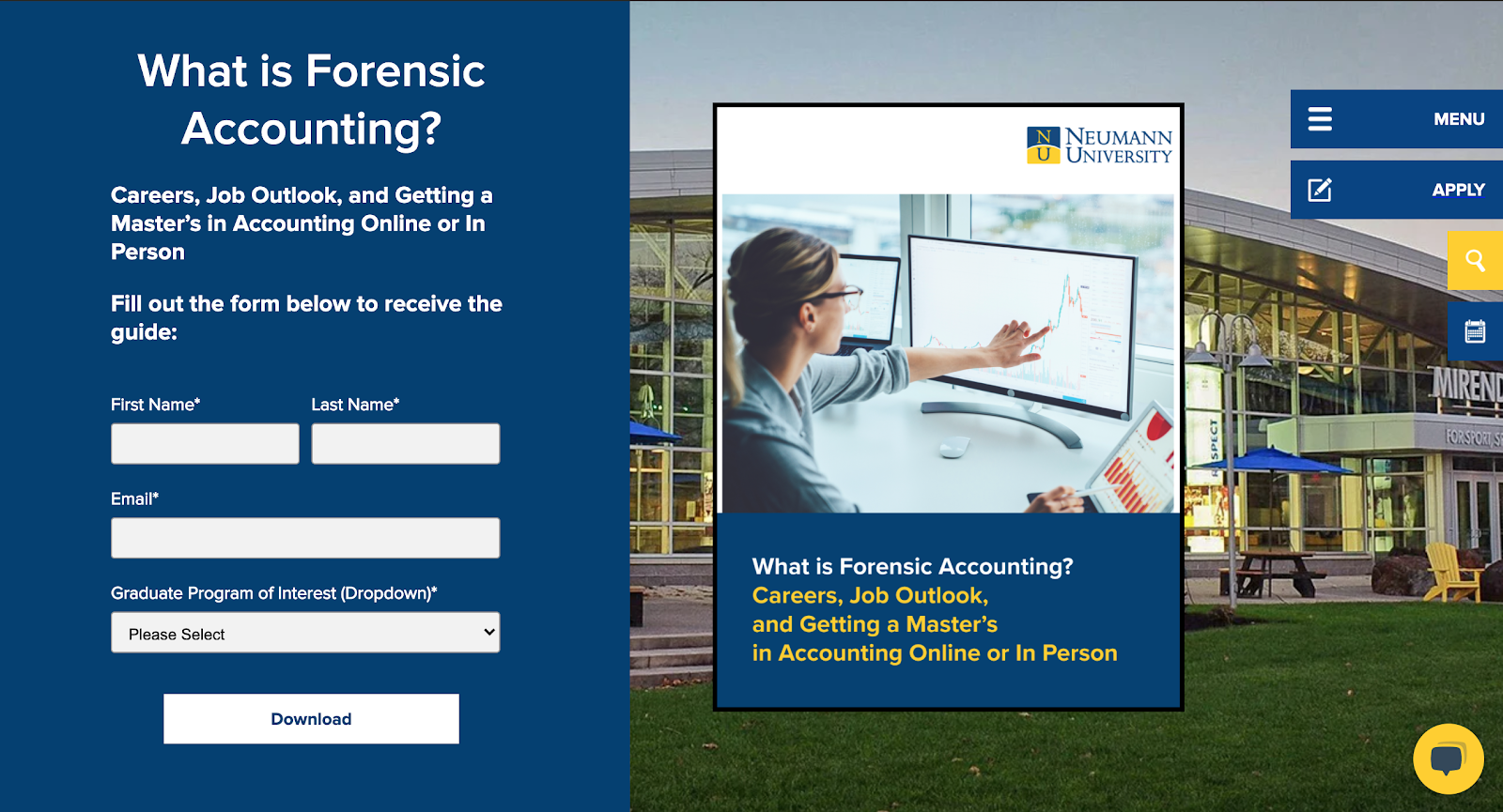
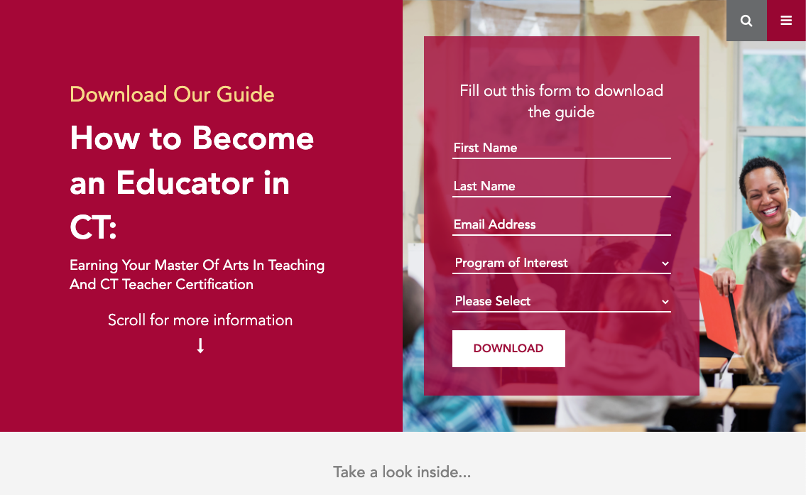
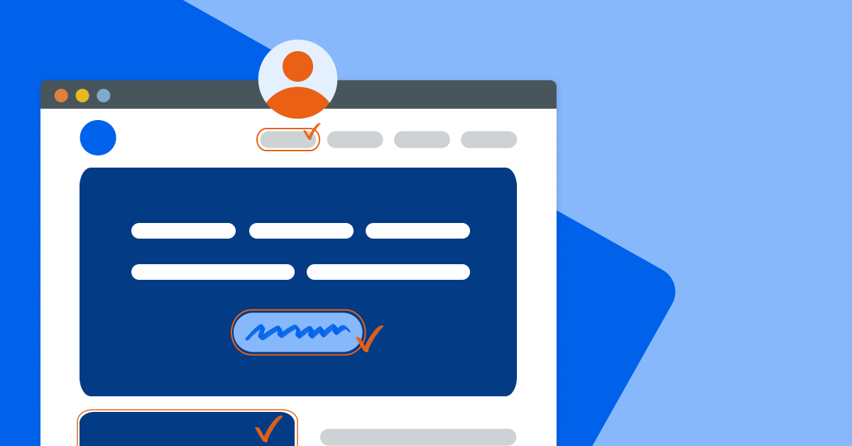
Check out the top half (a laptop view) of one of Neumann’s eBook landing pages below — the page is interesting, on-brand, and aces the first impression (click here for the full page).

2) Keep it simple and succinct (the KISS principle)
You know that frustration you feel when your keys are nowhere to be found, trapped underneath a pile of random items somewhere?
For a landing page to effectively draw a prospect to take a desired action (and prevent annoyance), it must be simple and succinct. In fact, if you have limited time and resources, one major step you can take is to audit your landing pages by imitating a first-time visitor. Ask yourself these questions:
- How long does it take you to find the form? (Is there digital clutter in the way?)
- Do you know exactly what you’re going to get after submitting the form?
- Do you feel any hint of overwhelm by all of the options, copy, or visual elements?
The main offer should be compelling and visually prominent. Unclutter your landing page if it has an excess number of graphics, images, and blocks of text. The visuals should point to what is most important on the page and each section should flow properly.
Make each section’s purpose easily recognizable by using section headers. Focus on telling and showing the user what they’ll receive from the offer, but beware of cramming in too much information. One easy way to infuse some breathing room is to separate tiers on backgrounds of different colors. And always follow the Rule of Three — avoid more than 3 different font sizes within one viewing frame of a landing page — to prevent your page from seeming overloaded.
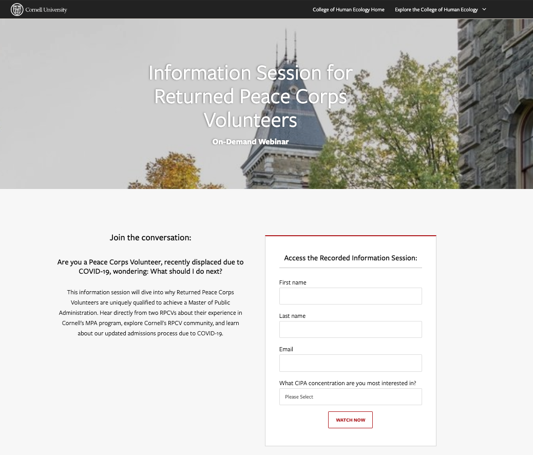
In this Cornell graduate program webinar page, the design and layout all points to the main offer in a clean layout, with concise copy (see the full page).
3) Be purposeful with your copy
Great copy shouldn’t be limited to your blog posts, eBooks, emails, digital ads, pillar pages, and other assets in your content strategy. On the landing page, a prospect makes a decision to convert on your offer or not. This copy should be powerful enough to seal the deal, and more importantly, it needs to pair well with the copy used in the media they clicked in from!
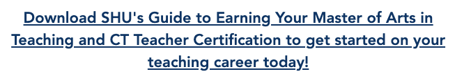
For example, in a Sacred Heart University blog post, the anchor-text CTA reads like this:
The landing page linked to from the CTA uses similar words in the headline and intro text, aligning with the copy in the CTA. If someone were to change up the description of the offer on the landing page, for example, calling it a “PDF eBook” instead of a “guide,” it may trip up the user and cause them to question if they’re going to get the same content piece. As a marketer, your job is to provide a smooth conversion experience that doesn’t bring up any bumps or friction.
Pay special attention to your section headers and pre-form text. Your copy should be informative, yet catchy; factual, yet persuasive. It should be in line with your target audience and their interests and pain points. Your CTAs should include action words with a sense of urgency.
Your value propositions should be laid out well: what will someone receive in return for their name and email address? Why should they subscribe to this particular blog or download this engineering eBook? Highlight what makes this resource unique and how it will help the user. Your headlines should be clear and informative, perhaps consisting of a power statement or statistic.
Then, use bullet points to break up blocks of text with intriguing questions and soundbites, like the possibility of more career data. These should be quick, at-a-glance reasons to download the guide or RSVP to an event that leave the user wanting a little more information. They’re now excited to see what’s inside the premium content or the webinar. In other words, if you give away the secret sauce upfront, they won’t be coming back to your restaurant when they can follow your recipe at home.
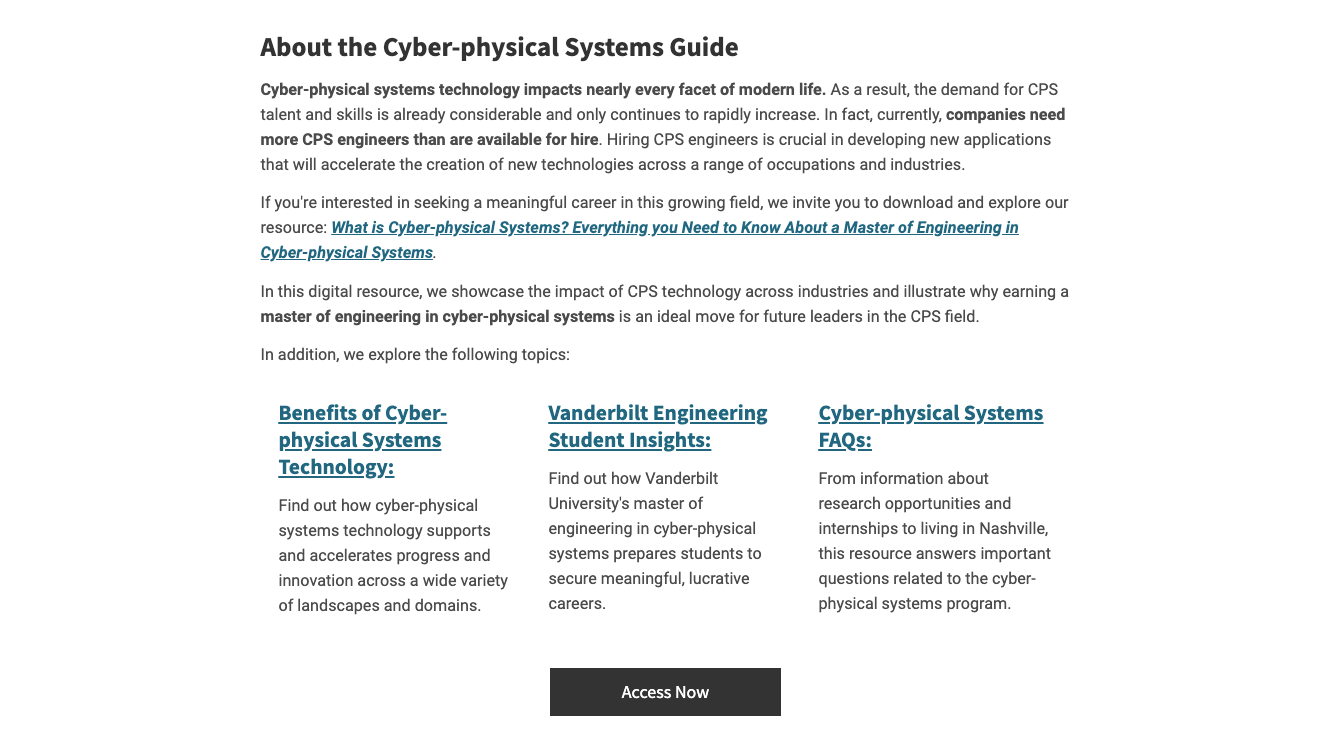
Finally, don’t forget to strategically scatter keywords throughout your landing pages. If you have a set of keywords for your eBook, you should make sure to include them on your landing pages as well to give your pages a little SEO bump. Check out a section of a Vanderbilt University guide download page for an example of purposeful, impactful copy (see the full page).
4) Include highly relevant pathways
It used to be that landing pages had a singular offer, with limited navigation, all in an attempt to keep visitors focused on one product. But that’s not best practice when it comes to inbound marketing for schools. If a user isn’t ready to convert on your primary offer, why not give them secondary and tertiary offers that they may be ready for?
The applicant journey isn’t linear; a successful content strategy consists of multiple content assets (in awareness, consideration, and decision phases) across pages that link to each other. This ensures that prospects are always seeing opportunities for resources they may find valuable at any given time. In the inbound methodology, it’s vital that you don’t have dead ends on your landing pages, which screech engagement to a halt and add friction to the applicant journey.
On an eBook download page or thank you page, you may want to include secondary content offers to relevant blog posts, for example, articles that are specifically about your program or event. Not only does this make sense for the user, but it also aligns with topic cluster methodology. If a few blog posts in one marketing campaign are targeting the same keywords as your landing pages, linking them to the blog pages will augment your SEO (and every little bit counts).
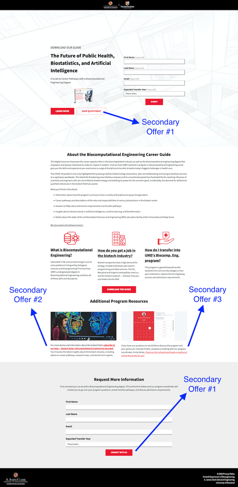
The University of Maryland has a guide about career pathways with an undergraduate biocomputational engineering degree. On their guide download landing page, their secondary offers include several relevant resources: a blog subscription, a book a meeting link with the program coordinator, and a Request More Information form.
5) Continually assess and evaluate your landing pages
The ‘set it and forget it’ approach doesn’t work well for landing pages (or for marketing in general!). Continually optimize your pages for the best chance of success and ensure that you're following UX best practices. In order to do that, you have to know what’s working and what’s not. Calculate your average view-to-submission rate across your landing pages, so you have a benchmark.
These are the main KPIs for landing pages that you’ll want to keep a pulse on:
- Traffic/Visits
- Submissions (all conversions)
- View-to-Submission Rate (submissions/views)
- New Contacts (first-time conversions)
- New Contact Conversion Rate (new contacts/submissions)
- Time on page
It’s also a good idea to perform A/B tests on your landing pages so you can assess which headlines, CTAs, and images are resonating the most with your target audience. Then, adapt and improve based on your results.
You’ll also want to routinely refresh your landing pages and switch out secondary content offers as appropriate. As you build more content assets and schedule additional virtual events, you may have different, more relevant or timely offers to promote.
Developing a solid landing page marketing strategy may sound complicated and time-intensive, but it doesn’t have to be. By implementing these takeaways, you’ll be sure to give your landing pages a boost so you can maximize your conversions, and ultimately, your applicants.
 WEBINAR


.png)