

As a typical first entry point for prospective students, college websites have always been a crucial instrument in any marketing strategy toolkit. And in a world where in-person campus visits are scarce, academic websites have to pack a powerful punch.
According to one study of 10,000 incoming high school seniors in the summer of 2020, 85% percent of students said they relied more heavily on college websites for information in light of the COVID-19 pandemic, and about 39% said that they had discussed their options less with their counselors.
Prospects are counting on your website (now more than ever) to 1) deliver a seamless experience where they can quickly find all of the information they need, 2) give them a sense of the campus culture and student experience, and 3) offer a painless way for them to request additional details and get in touch with questions.
The reality is college websites aren’t going the way of paper viewbooks anytime soon. While many enrollment marketers may lack total control of their site, there are plenty of elements that they can implement or advocate for.
I scoured the internet to find some of the best college websites, so you wouldn’t have to. These are some of the components I saw over and over again (plus examples of my favorites!).
What makes a great website?
Attention to user experience
The experience people have — particularly prospective students — on your website is just as important as what’s actually on it. User experience (UX) encompasses factors like how easy your site is to use, accessibility, responsiveness, and the way content appears — and is digested. It’s especially important for academic websites to prioritize UX because there’s stiff competition when it comes to attracting these students. A satisfying experience on your website can help differentiate you; provide the opposite, and you’ll see your bounce rate soar.
Consider the following ideas to help improve your UX:
1) Have a clear call-to-action (CTA) always visible
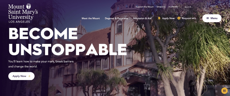
There’s a lot to like about landing on the home page of Mount Saint Mary’s University (MSMU). What I like most is the clear CTA in the hero tier — and the CTAs in the nav for applying and requesting more information (RMI). It ensures that, no matter how far down you scroll, the action you want your user to take is obvious and easy to find.
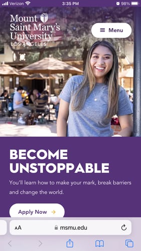
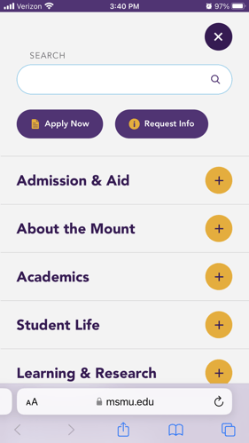
 The UX is great on mobile, too. MSMU hides the universal navigation behind a hamburger menu (a smart way to conserve space on mobile) but keeps the primary CTA above the fold. And when you click on the menu? The most important CTAs are up top and emphasized — exactly the way they should be.
2) Shorten your RMI forms
You probably have an inquiry form of some type on your college admissions website or your college’s program page. But how long is your form? Having more than 4 or 5 fields (whether they’re required or not) is bound to discourage and deter your website users who are short on time.
MSMU does a great job of simplifying its RMI form, as you can see below. A bonus: MSMU also follows UX best practices by having one form field per line, which helps prevent any confusion and continues the downward momentum of filling out the form.
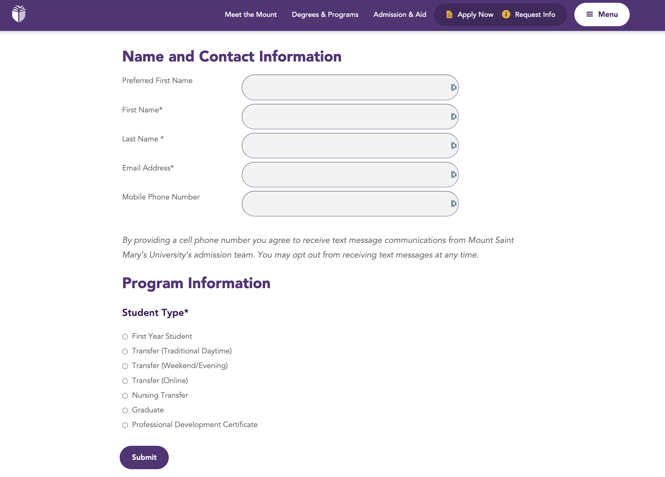
A college degree is a major purchase, but there is plenty of time to route prospects through the applicant funnel. On an inquiry form, boil it down to the data you really need for your recruiters to effectively communicate with them. Usually, the best college websites have forms with just first name, last name, email address, and term of interest. If you have a CRM with advanced marketing automation features like progressive fields, you’re able to have shorter forms with a lower barrier to entry. Then you can have variable fields displayed for prospects based on previous data captured. If your CRM doesn’t make this an easy task, you may want to consider upgrading or augmenting your tech stack, like using HubSpot for higher education in addition to application-based CRMs.
Members of Generation Z are even more apt to appreciate quick forms—seeing as how 45% of them are online “almost constantly” and 95% of 13- to 17-year-olds have access to a smartphone. A bite-sized approach to college inquiry forms is likely to be much more effective.
3) Use "breadcrumbs" as a navigational element
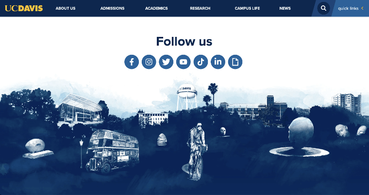
Breadcrumbs are a type of secondary navigation element that offers users a contextual trail of links to help them understand and navigate through a website's hierarchy effectively. You’ve heard of Hansel and Gretel and how they use breadcrumbs to mark the path they took through the woods? It’s essentially the same thing, applied to a website. Below is an example from the University of California - Davis.
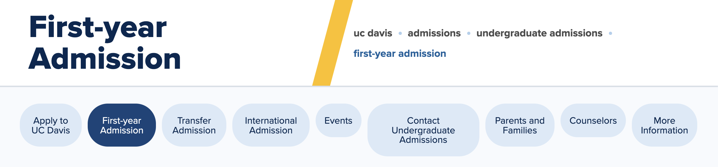
Breadcrumbs help users:
- understand where they are within the website's structure
- navigate back to higher-level pages quickly (and without needing to repeatedly use the browser's "back" button)
- by providing a clear and intuitive navigational aid
4) Ensure your site is accessible
A good user experience is one that considers the needs of all users, including individuals with visual, hearing, motor, cognitive, or other disabilities. While there are legal ramifications to not having an accessible site, there are a ton of benefits to accessibility (other than the ethical ones). An accessible site gives you a broader audience reach, improved SEO, and aligns with design principles. The more accessible your site, the better looking it will probably be.
The Resource Library for the Vanderbilt School of Engineering is a good example of high color contrast between text and background. It’s essential for readability — and it just looks really good, too.
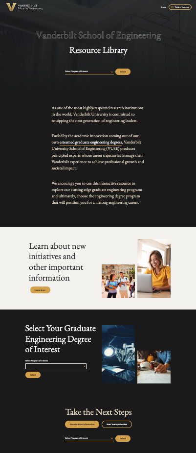
And it passes the contrast test with flying colors.
Creative web design
What the best college websites do differently is this: they build user experiences with impressive designs that complement the website architecture instead of detracting from it. If you’re an enrollment marketer with less control over your site than you’d like, advocate for these principles and provide input to the in-house team or agency that handles your next university website design.
For prospects today, your college website is one of dozens they might land on, so your site needs to stand out. Here are a few things to consider:
- You need a strong visual identity that's attention-grabbing and implemented consistently throughout the website.
- Your site needs to communicate how your brand differentiates itself in the market: what are the unique qualities, programs, and campus culture, and how does your site express it visually?
- Your site has to create an emotional connection with prospective students. What imagery, storytelling devices, and evocative design elements are you using to help students picture themselves in your community?
Everyone applying to college (at least to undergrad) has grown up with the internet. They're savvier than ever. You've got to elevate your site because the competition is fierce, and the expectations are high.
The best of the best: higher education website design
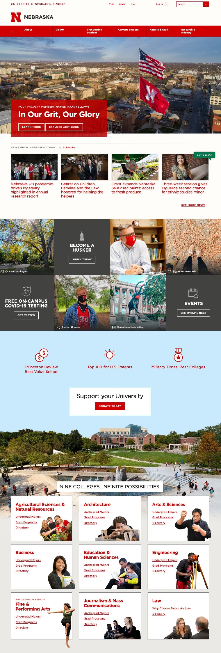
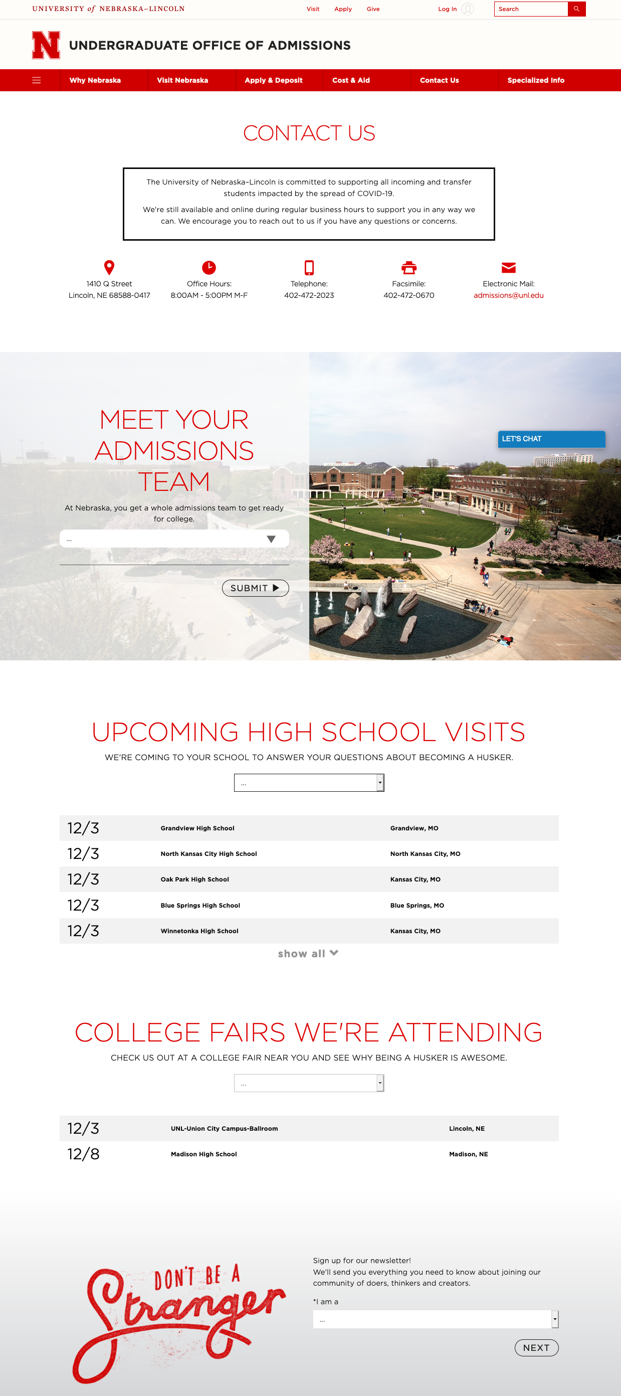
The University of Nebraska-Lincoln has a beautiful homepage with a clean navigation bar, news stories, Instagram snapshots, a list of colleges with links to undergrad majors, and even a chatbot. And their undergraduate Contact Us page is just as impressive with copy and design that embodies Midwestern friendliness.
The Rhode Island School of Design (RISD) is a great example of how a school’s brand can come to life through website design. Everything about it is visually compelling and wholly different from a typical university website. Scrolling through the home page feels like you’re looking at an artist’s portfolio, and that’s by design. Notice, however, that the home page has many of the typical elements you’d see on a university home page like upcoming events, blogs, CTAs for info sessions, and more — it’s just all done in a distinctly RISD way.

Interactive and multimedia elements
The best university websites are the ones that create a captivating digital experience for their prospective students. Students must be able to picture themselves at your school. Without an understanding of how they fit into the community and what to expect, they won’t move past the inquiry stage.
Creating an immersive digital experience requires both multimedia and interactive elements, which will help boost engagement, enhance your brand’s storytelling, and deliver information effectively. Here’s what this looks like in practice.
Virtual tours
While virtual tours have been a thing for years, the pandemic accelerated the need for online campus tours even further. If your school doesn’t have one, there are plenty of companies ready to help (Appily, CampusTours, YouVisit, etc.). What’s great about these tours is that they double as an immersive experience and a lead generator, so you can learn more about the people “touring” your school.
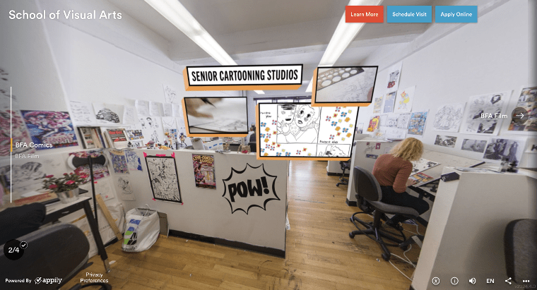
While every school should arguably have a virtual tour, schools with differentiators that are easy to capture visually must take advantage of this. The School of Visual Arts (SVA) in New York has a virtual tour that takes users through classroom spaces like a printshop, a comics department, and a 3D modeling studio.
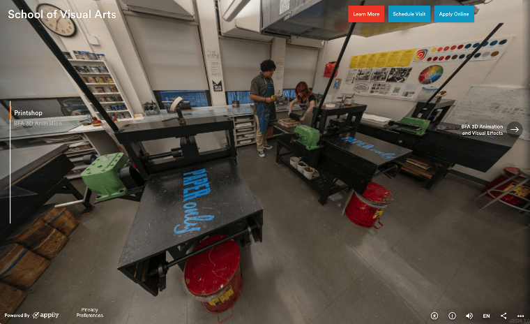
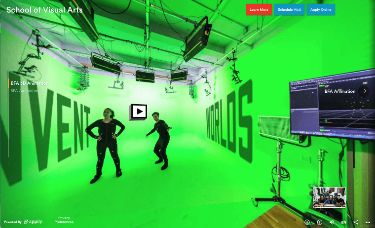
There are interactive elements, as well. By clicking on a button, you can see examples of the work in more detail, featured alumni or faculty, relevant coursework, videos, and other ways to engage with the space.
Higher ed websites with interactive and multimedia elements
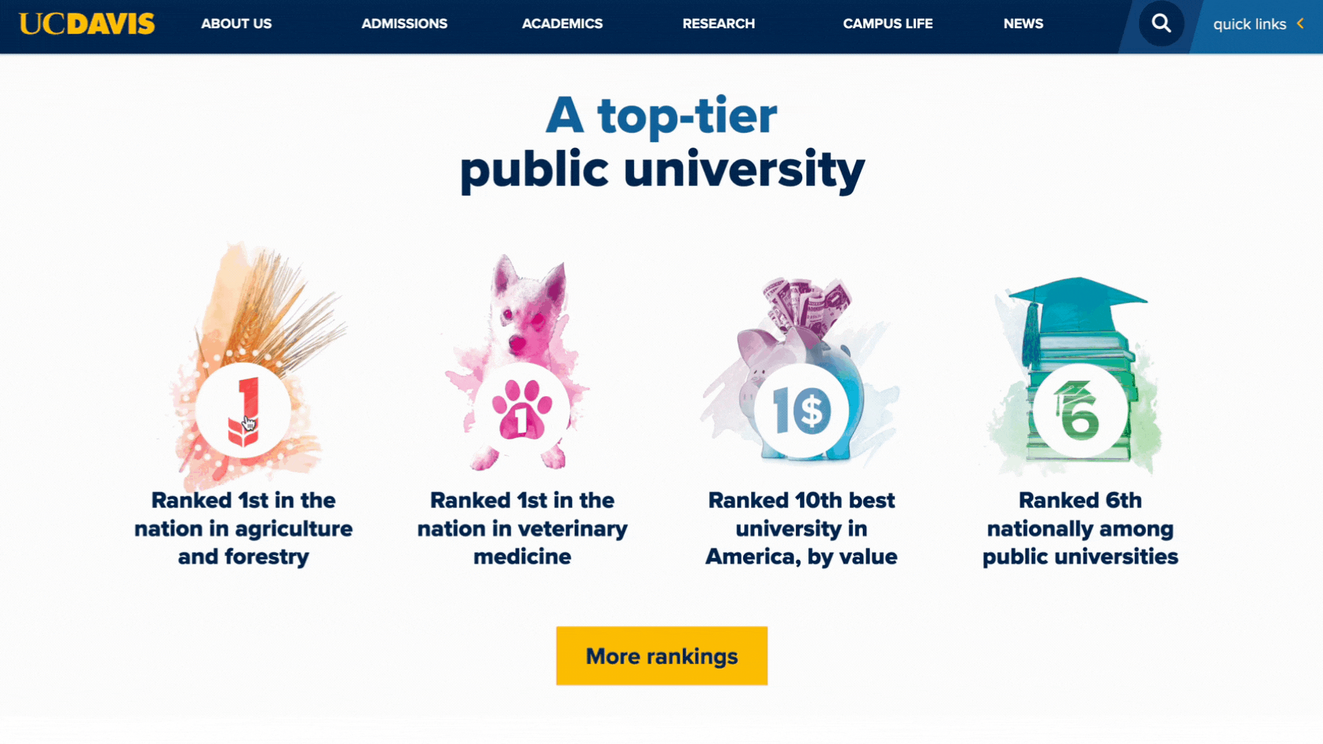
Compared to its sister schools in Los Angeles, San Diego, Santa Barbara, and Berkeley, UC Davis’s location is less well-known: in a suburb called Davis outside of Sacramento. To compete with these desirable locations, UC Davis has branded Davis as “California’s College Town” — it’s green, laid back, and friendly. And they’ve branded themselves similarly, despite having two very traditional collegiate colors as their primary brand colors.
UC Davis’s website has a lot of cool design elements that lend to the friendly, chill vibe, including a watercolor graphic treatment and illustrations throughout.
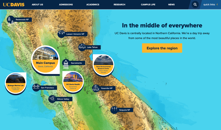
UC Davis has also created an interactive map module that helps students comprehend the location (and all its benefits!).
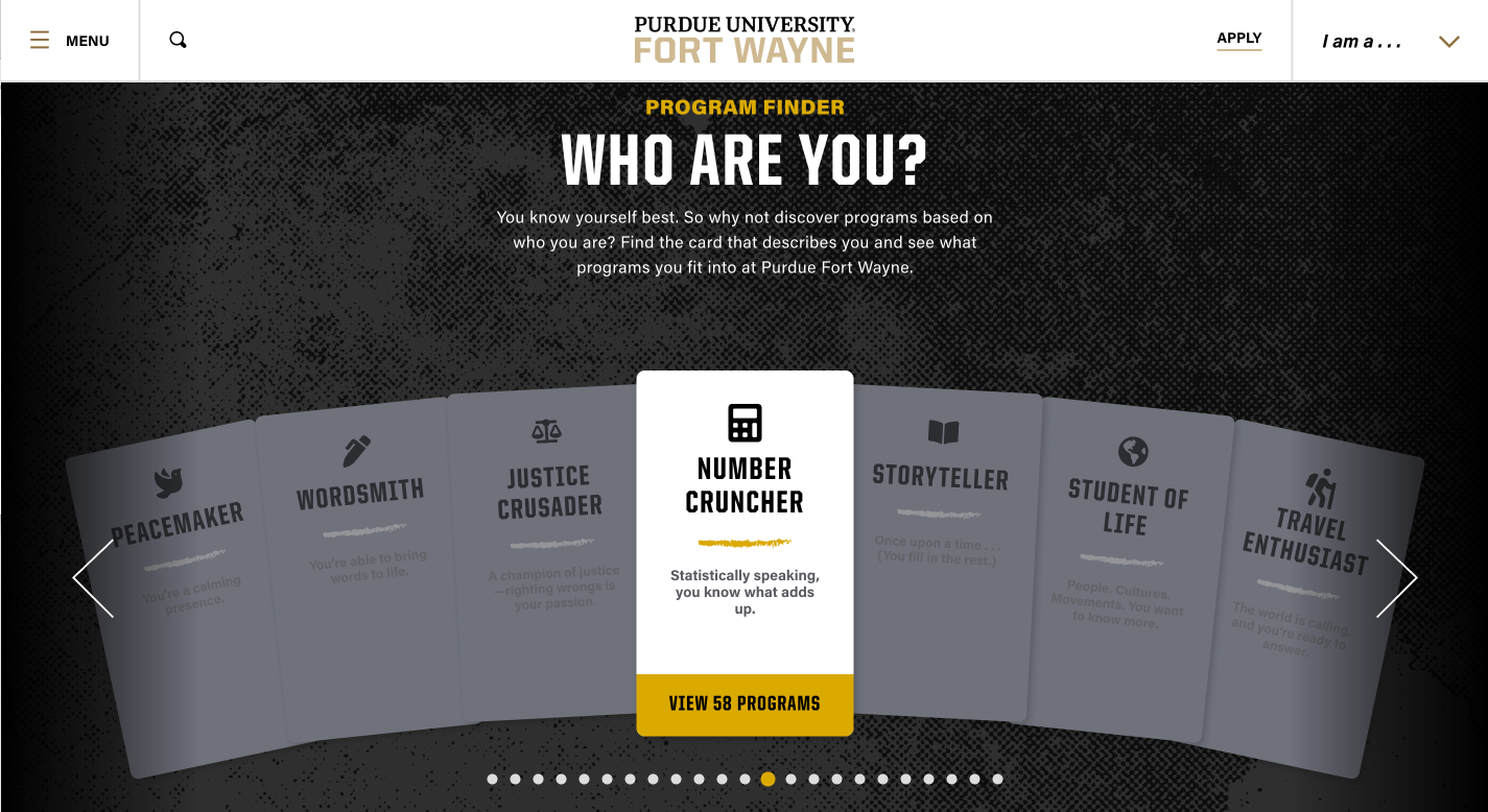
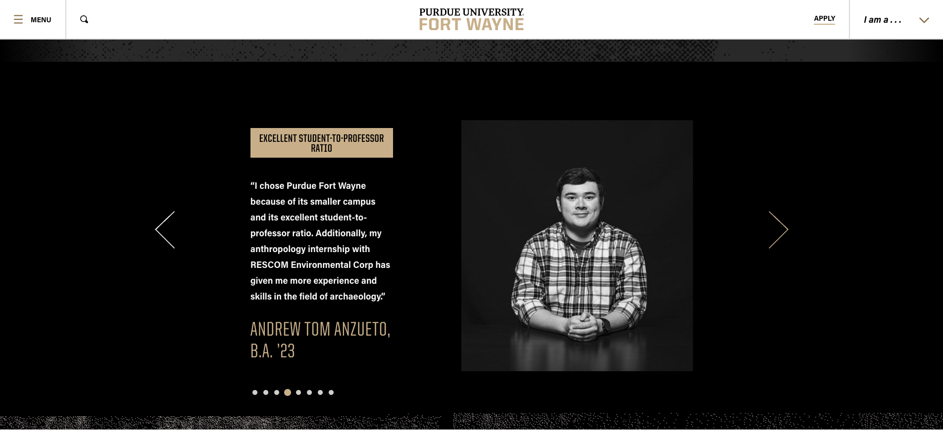
Purdue University Fort Wayne centers the prospective student in its Program Finder module. For those who may not know exactly what they want to study, this gamifies the admissions process, creating intrigue while making the prospect feel seen.
Purdue also elevates the testimonial tier, featuring professional black-and-white photography of current students.
A robust content strategy
If you're creating content — and that’s what a website is — you should have some sort of strategy. A well-defined content strategy outlines the goals, target audience, messaging, and content creation plan, ensuring that the website’s content is not only compelling and informative but tailored to resonate with the specific needs of the prospective students.
A proper content strategy should be informed by SEO, relevant market research about your audience, and current events and trends. And your content strategy is not limited to the biggest pages on your website.
Create blog posts with relevant keywords and CTAs
Many of the biggest college brands rely on their rankings or names to attract organic visitors to the site. But a good content strategy is much more focused on the nonbranded things prospective students are searching and creating content that answers those questions.
With a little keyword research, you can make your content work even harder for you and do much more than inform and entertain your prospects. Keyword research will help you generate relevant blog post topics as well as help you make solid strides in your organic rankings. (Check out one of our latest posts for how to develop a blog content strategy as part of your enrollment marketing game plan).
The best college websites include blog posts with clear calls to action at the conclusion (and sometimes throughout) — attend a webinar, download a digital resource, request more information, etc.
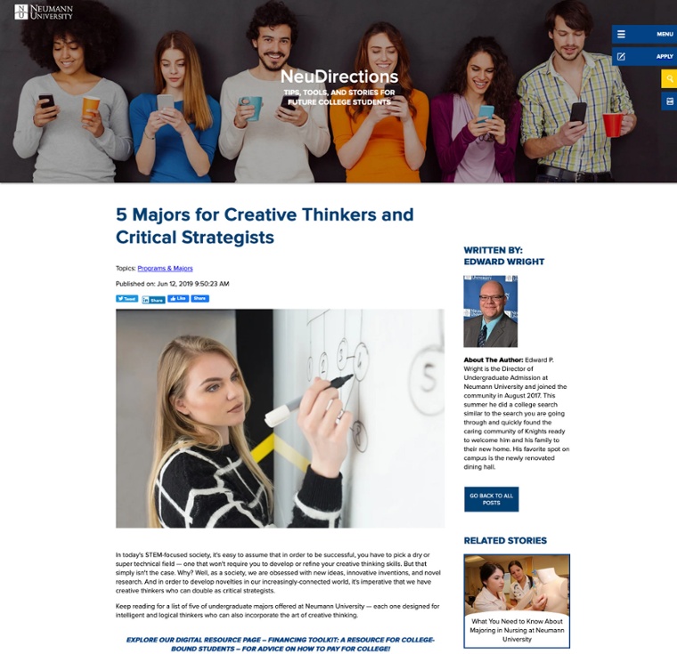
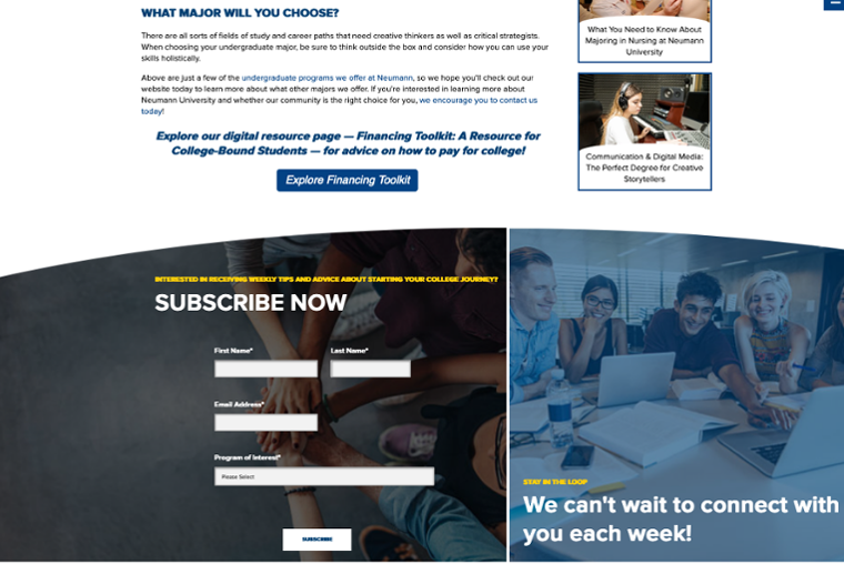
Neumann University’s undergraduate blog, called NeuDirections, has a post titled “5 Majors for Creative Thinkers and Critical Strategists” which has several links and calls to action, from a program listing to a digital resource about financing higher education.
The power of program pages
It’s easy to think that the most important page on your website is the home page; I mean, it’s the home page — that’s where you’ll be making your first impression, right?
Wrong! More prospective students than ever are discovering programs and schools via search engines. Often, they search for a program or a career they'd like to pursue first; then they explore the school a little deeper. Case in point: In one survey of teenagers, 93% said their No. 1 reason for visiting a college website was to find out about majors/academic programs.
All this means that...
- You need to showcase your programs extremely well or risk frustrating your prospective students.
- Your program pages must be simple to navigate, include your brand colors, and exude your institution’s personality and style.
- You have to optimize your program pages for relevant keywords.
- Each program page should contain the types of content and information that prospective students find helpful.
It's a lot to manage. Here are a few schools that are doing it right.
University of Central Florida’s program page is not only incredibly helpful, it’s actually delightful to use. You can either search among all bachelor’s or graduate programs or you can click to see separate lists of bachelor’s, master’s, and doctorate degrees. They even include an option to browse by college instead of degree type. 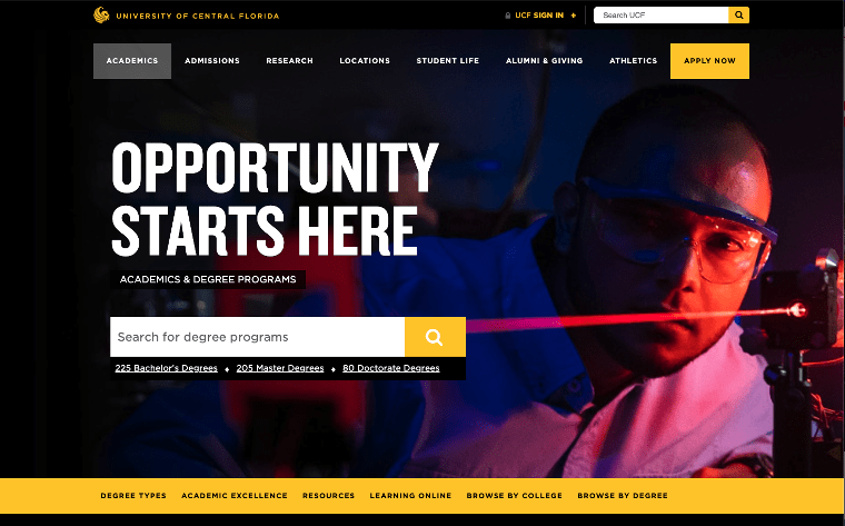
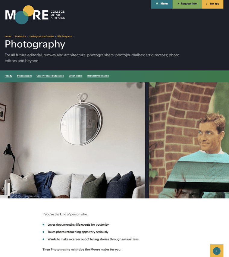
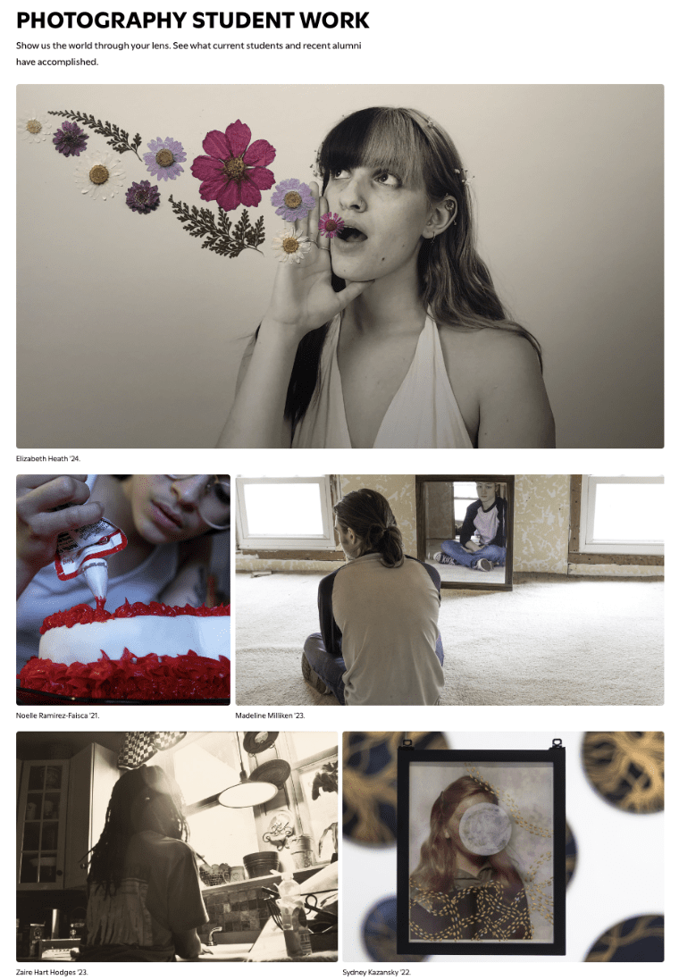
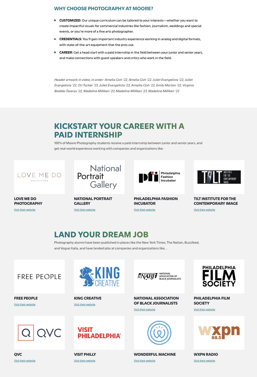
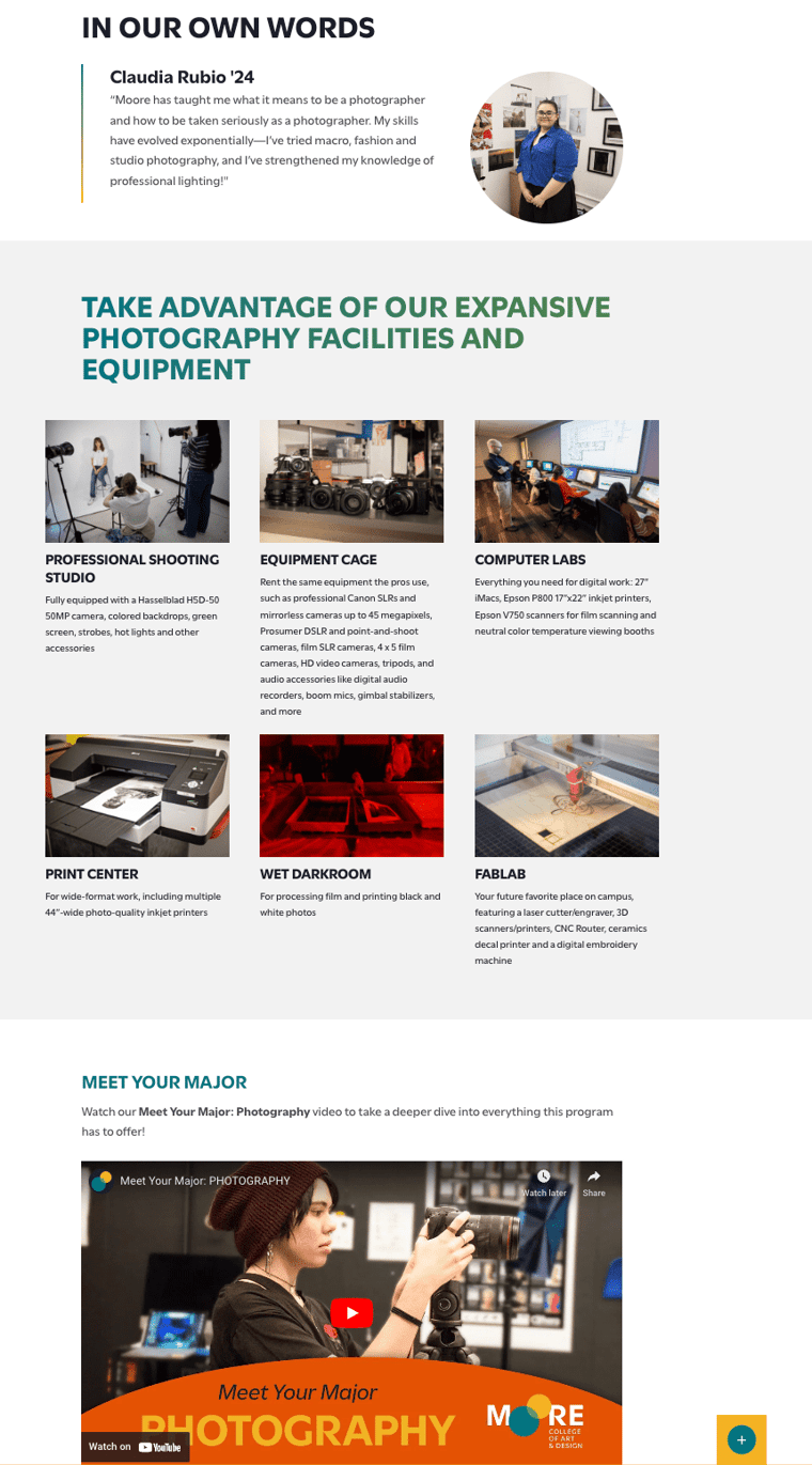
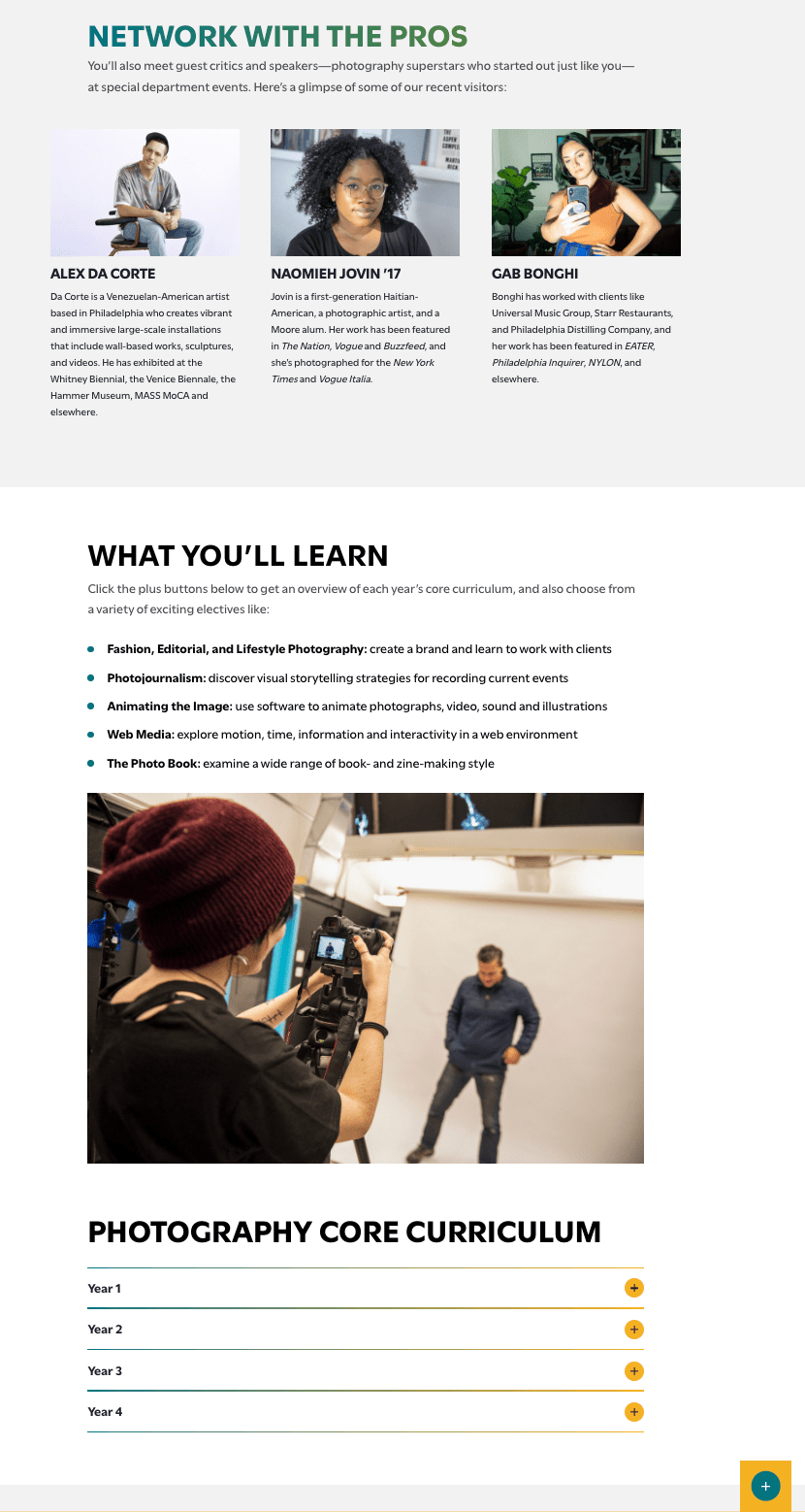
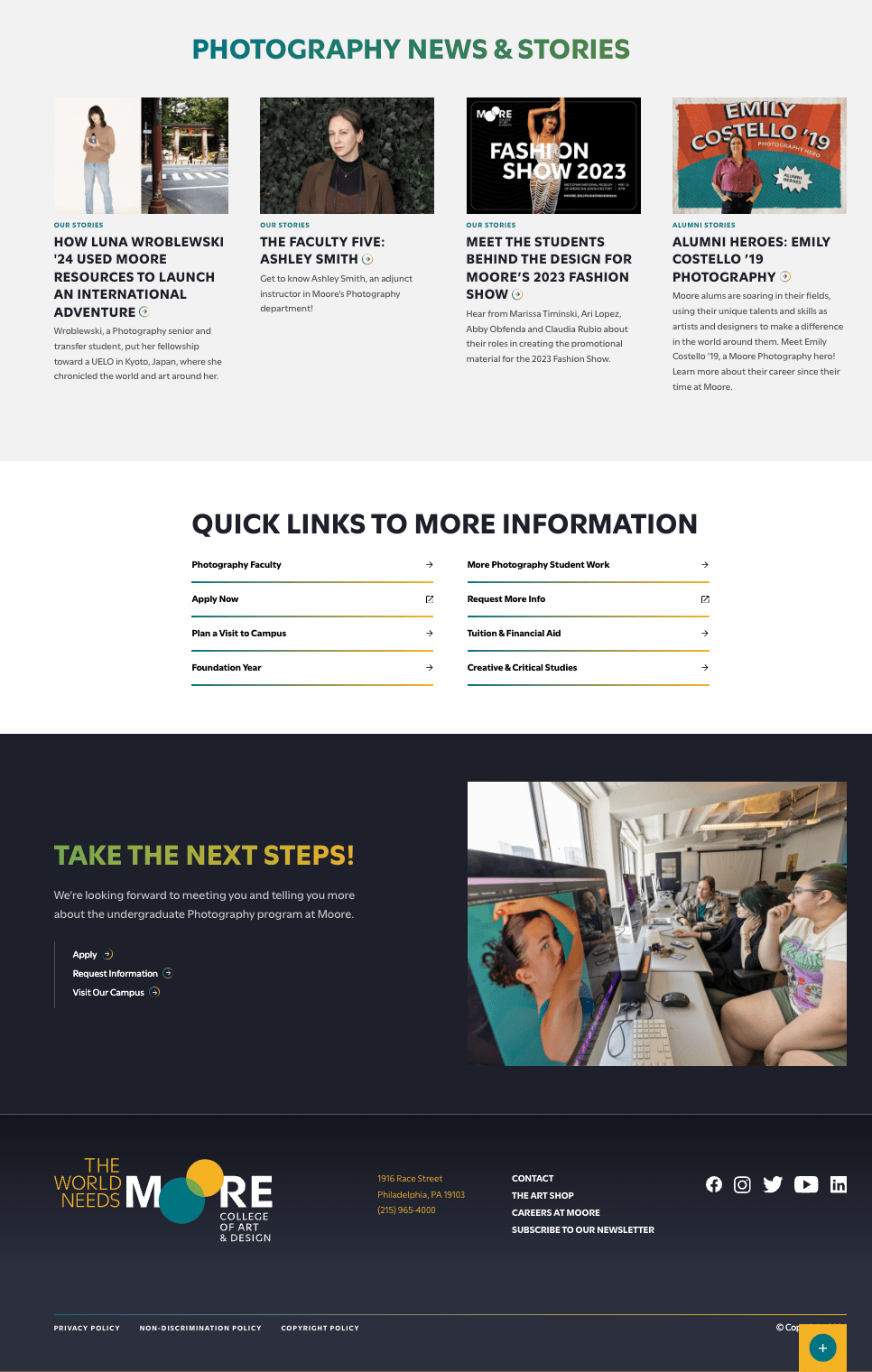
Moore College of Art & Design has a fantastic approach to each of its program pages. (Below is the BFA in Photography page.) When a prospect first lands on the page, it’s about them: the career they might want and who they are. After that, the page transitions to feature student work, a section about why someone should choose photography at Moore, information about paid internships, where alumni have landed jobs, testimonials, equipment the program uses, a video about the program, featured speakers, the core curriculum, a blog widget featuring photography-related stories, and a quick links section. Moore’s program pages are a masterclass in how it should be done; they are packed full of anything a prospective student might need and wonderfully designed.
Optimizing your college website will reap dividends for your bottom line—attracting, engaging, and delighting your prospects and leads. Take the time to figure out which elements of the best college websites you can immediately put into action, and which ones you can add to a longer-term marketing strategy for student recruitment.
Here for your higher education web design needs
From website design and development to content strategy and SEO, DD Agency can help level up academic websites of all kinds. Your site deserves to be amongst the best college websites, and we can get you there.
Learn more about how we can help — request more information!

.jpg) EBOOK
EBOOK


.png)