Why You Need Landing Pages to Get More Out of Your Digital Ads

September 30, 2015

What if a friend asked you to meet her for happy hour, but when you showed up at the bar, you couldn’t find her in the crowd?
That’s a little bit what it feels like for prospects who click an ad broadcasting a graduate program information session, only to be redirected to the institution’s busy homepage. What initially piqued their interest turns into an inconvenience that may just take too much time or effort to be worth their while.
Where do you direct them instead? How do you avoid sending your prospects to a page out of a Where’s Waldo book?
The solution is the landing page.
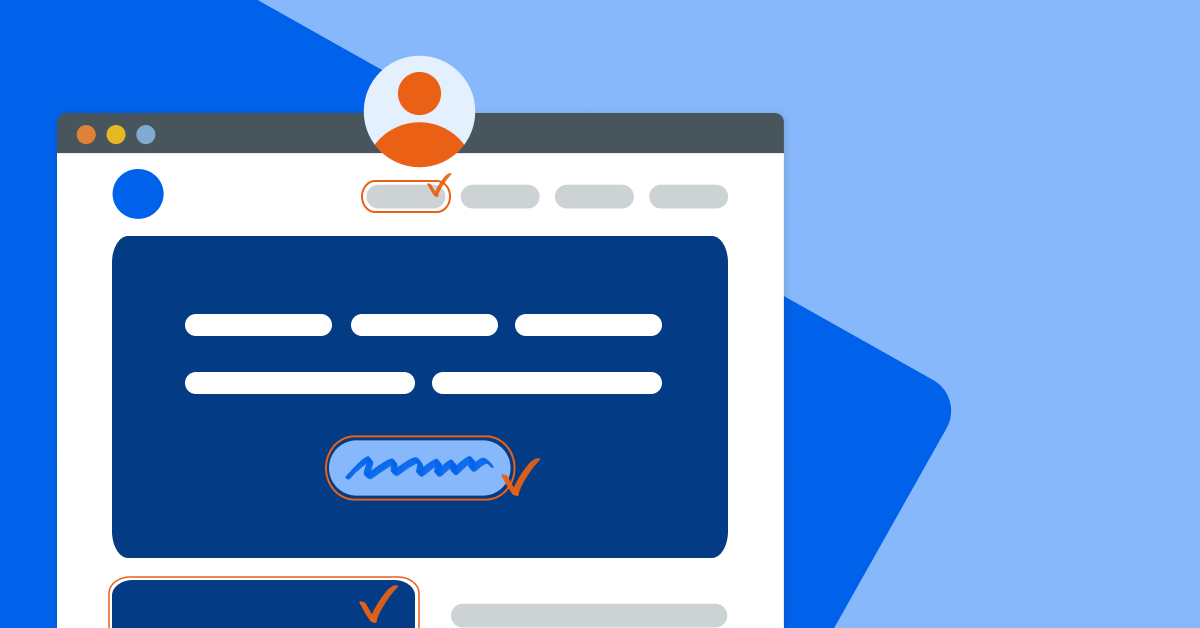
A landing page is a page that exists only to capture a visitor’s information through a form. Landing pages can vary in look, purpose, and content, but their main function is to convert visitors into leads. In fact, companies with 30 or more landing pages generate 7x more leads than those with fewer than 10.
They’re typically used for offers of some sort — whether that be an invitation to an event, an eBook download, or registration for a webinar — and there are myriad applications for your enrollment marketing. Here are just a few ideas:
- Host premium content you’d like to gate with a form
- Collect RSVPs for events like program information sessions (for a more comprehensive RSVP form, read more about using microsites for event marketing)
- Allow visitors to indicate that they’re interested in speaking to an admissions counselor about a particular program
If you’re on a marketing platform like HubSpot wherein you have control over some subdomain of your institution’s website (think “info.myinstitution.edu”), you can make a landing page yourself without disturbing the rest of the website (or going through IT!).
When you begin making your own landing pages, what best practices should you keep in mind?
Your landing pages should…
1. Be Informative
Digital ads are limited in size and character count. While a prospect was interested enough in your info session or eBook to click your ad, don’t assume that they know any more about your institution and its opportunities than what you’ve already told them.
This is your opportunity to explain what your offer or event is about — concisely. We recommend using bullet points and images to make your page easier to read quickly.
2. Be Simple
This page is only about your offer, so eliminate anything irrelevant, including links and any navigation menus that may lead your visitors somewhere else before they fill out the form.
A clean look will also help guide your visitor to the form. Don’t overload on text or images beyond what effectively describes your offer.
3. Set Their Expectations and Meet Them
By the time they read more about what you’re offering and get to the “submit” button on your form, your visitors should have a clear idea of what’s being offered and how they’re going to get it. (Think of how different this is from being directed to your homepage, or even a program-specific information page, from the original digital ad!)
Ideally, your landing page should redirect to a “thank you” landing page, where they’ll see that their event RSVP went through, be assured that an admissions counselor will be in touch, or find a button to download your eBook. While you still have their attention, consider adding another call-to-action on the thank you page for further visitor engagement!
Click-throughs on digital ads are a great opportunity, so making the most of where you send these visitors is imperative. Treat these visitors like you would a busy, high-level business executive with very little time: be prepared to give them what they’re expecting, when and how they’re expecting it. And get excited to meet your new leads!
Interested in seeing some examples of great landing pages? Download our guide, 5 Landing Pages That Rock!
.jpg) EBOOK
EBOOK
See how schools are using HubSpot for their enrollment marketing
Service Categories: Inbound Marketing, Digital Advertising, Content Strategy, Website Design & Development


.png)